Are the advertisements a certain style?
When researching various adverts I noticed that most of the adverts were very dramatic. This could be mostly due to the fact that the adverts were based on very serious subjects, for example blood donations and anti bullying campaigns.
Do they use certain techniques?
I also found that the majority of adverts used an emotional response technique. The emotional response used was fear, this was used in drink driving adverts as well as drug driving. I think the more serious adverts use an emotional response technique, in order to get a response from their audience.
How do they target their audiences?
They target their audience through the use of emotional responses, as well as, making their adverts dramatic, so that it is hard to pull away from the screen. They leave the audience feeling shocked by what they've seen, wanting to make a difference and change their lifestyle.
What conclusions can I draw from it?
I can conclude that these similar adverts all used the same techniques and styles in order to target their audience. They have a sense of fear surrounding their advert, which really captures the audiences' attention. Therefore, I can conclude that some emotion should be shown in the advert to appeal to more viewers.
What should I be doing in my own advertisement?
In my own advertisement I will use the techniques that I feel are most appropriate to the type of advertisement. In this case I will use emotional responses as well as using a dramatic technique to target my audience. I will also look into my research to determine the most appropriate channel, at the most appropriate time.
Evaluate how reliable the research is?
I feel that my research is very reliable, as this research was through secondary resources that were very trusted. I also collected my result from various resources, this way I can provide myself with a rough evaluation of the true data. Therefore, overall I feel my research was reliable.
Where the results global or just uk? will this influence me results?
Some of my results were global however some were from the UK. This will influence my results as there are other variables that come into place globally. For example if some results were from America, this would affect my results as there is a greater population in America.
Thursday, 25 September 2014
Tuesday, 16 September 2014
Advertising Placement


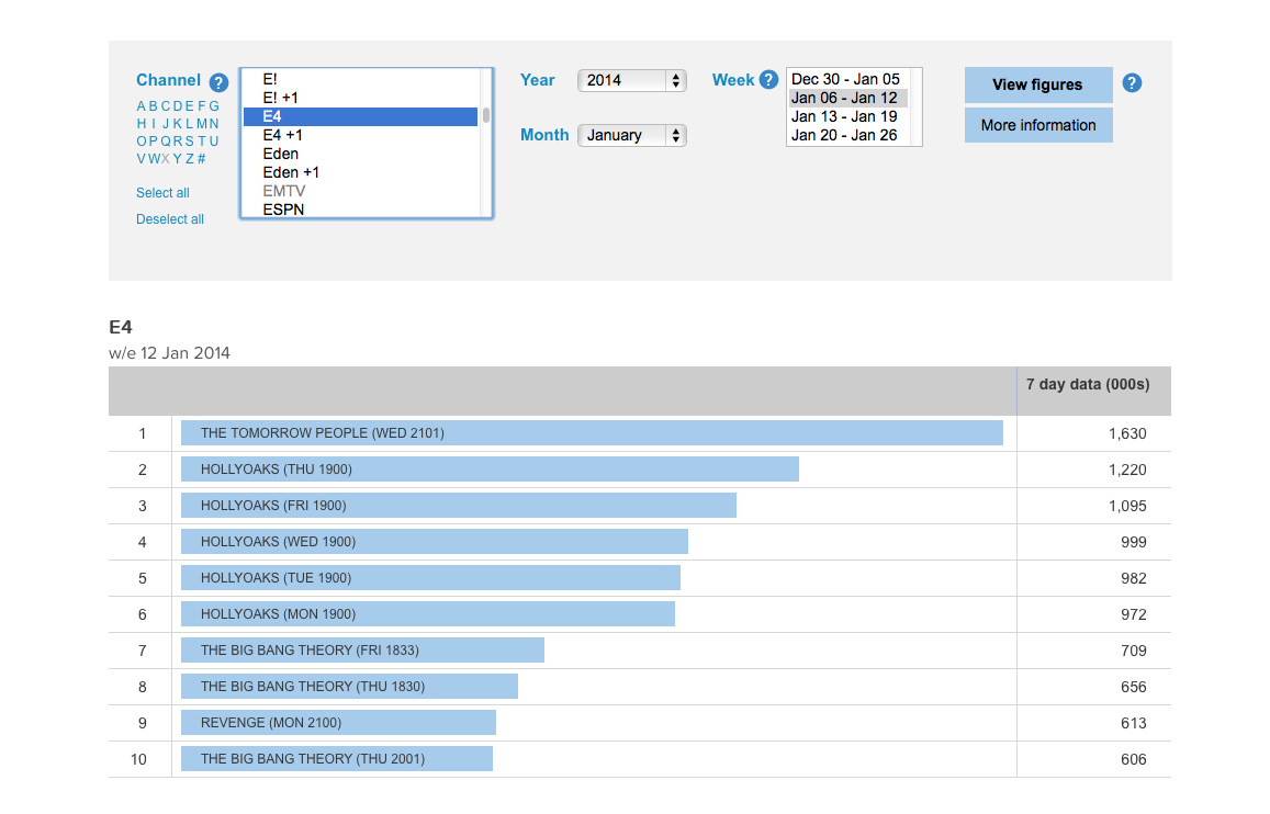


I have researched various T.V. channels that in my opinion teens would watch. I can see from the data what programmes were viewed the most, as well as when they were viewed. With this data I can form my own opinion on when to show my advertisement, as well as, on what channel to show it on. The most suitable channel to put my advert on is E4, this is because it has the most viewers from the channels I selected. The best time to show the advert would be after 9 in the evenings, this is due to the data showing that this was the time with most people watching.
Wednesday, 10 September 2014
Monday, 8 September 2014
Risk Assessment
This is a risk assessment, there are various different risks that I have listed, along with instructions on how to reduce the risk of these happening. I gave a brief description on what the risk was, as well as giving this risk a rating on how likely it is to happening.
Thursday, 4 September 2014
Market Research - Competitor Analysis

This website uses short and brief sentences as it is for kids and they might lose focus or may not understand if the sentences are long. The font used is very plain and dull, therefore not very eye-catching. There are no images shown on this website, this is a disadvantage as this would help to capture the target audience. The website as a whole is very dull and not very eye-catching to its target audience. They have used a light blue background for the website, as well as highlighting some parts in white. These are very dull colours, in order to capture their target audience some brighter colours could be used. Different colours of font could also be used, especially seen as the main information given is in black. There is also lots of space on the screen that has not been used, this is bad because it makes the page look as if there isn't much information displayed. To improve on this they could fill these gaps with some images, or maybe a short video on these tips suggested.

This website is very good at attracting their target audience through the use of colours. For example, where it says 'teens' there is a blue symbol as well as a red one. This represents the two genders and how anyone of any kind can become a victim of bullying. They also use up to date technology, which is a good way of targeting the target audience as well as promoting themselves. For example the hash-tag next to 'gensmartphone' is a way of getting people to talk about their site on social networks. They have also used effective sizes of font, making the 'online' bigger in comparison to rest of the sentence. This really puts emphasis on the word 'online' asking a rhetorical question. This website also uses different images, however, there is a big space in the middle of the screen. This is bad because the middle of the screen is where most of our attention diverts to and there is nothing there. However, mostly dark colours are used which highlights the effects of bullying. An improvement would be to use brighter and more lively colours, as children that are effected by bullying may respond better to seeing brighter colours.

This website is very good at capturing their target audience through the use of animation. They have developed an animation of a 'rescue run' which demonstrates ways to avoid bullying. As well as this there is a great variation of different colours, which makes the website very aesthetically appealing to children. There is also are wide range of different fonts used in different shapes and sizes too. This makes the website look very lively and effective, as there is so much going on. However, a disadvantage of this webpage is that the colours in the background are very dull. An improvement that can be made would be to use brighter and more lively colours, as children that are effected by bullying may respond better to seeing brighter colours. Another improvement that could be made would be a brief description on the webpage explaining the purpose of the website, and how they plan on achieve this purpose.

This website uses one bright colour, however, an improvement that could be made is to have a greater variation of bright colours. There are no images on this website, which can make the website look unappealing to children. As well as this, there are blocks of information which children may not be able to read. Therefore an improvement would be for their to be a summary of each paragraph so that it would be more striking to their target audience. Also, the same font is used everywhere over the webpage, which can create an uninviting effect. An advantage of this webpage is that they have used different font colours, depending on which section the text is on. This is good because it draws more attention to particular texts, which makes the audience know exactly where to read. However, the grammar used isn't very suitable for their target audience, words such as 'encounter' may not be within most children's vocabulary. An improvement for this would be to use smaller words more suitable for children.


This video is very effective as it uses humour to entice its audience, the humour used is in the narrative as well as in the animations. The animations are continuously moving and they change instantly, which makes the video very interesting and appealing to its target audience. They also include key information, and analyse the information, in attempt that the audience will remember what was said. However, everything is in black and white which can be very vague. In order to improve on this they should add more colour to the animations, which would spark more colour to the video making it more eye catching to their target audience. The video is constantly changing, as are the fonts in the video. The font that is used is very engaging as it is not very formal, however it is very artistic. This helps to appeal the target audience, as it is more noticeable than others.


I like the colours used in this website because they appeal to both genders, which represents that anyone can be affected by bullying. I also like the layout of the website, everything is evenly spaced out with each different page having a brief description beneath it. However, a critique is that the same font is mainly used with the same black colouring. This provides a dull look on the website as black is not a very eye-catching colour. I also like that there are some animations at the top of the website that resemble different social networking sites. This is very creative and really provides a contrast on the website. Another critique is that the background is very plain, they could chose a different background colour to make the website more appealing to their target audience.
Subscribe to:
Posts (Atom)