Thursday, 25 September 2014

Tuesday, 16 September 2014
Advertising Placement


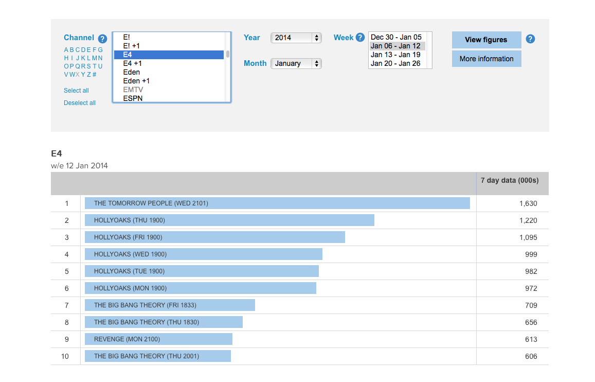


I have researched various T.V. channels that in my opinion teens would watch. I can see from the data what programmes were viewed the most, as well as when they were viewed. With this data I can form my own opinion on when to show my advertisement, as well as, on what channel to show it on. The most suitable channel to put my advert on is E4, this is because it has the most viewers from the channels I selected. The best time to show the advert would be after 9 in the evenings, this is due to the data showing that this was the time with most people watching.
Wednesday, 10 September 2014
Monday, 8 September 2014
Risk Assessment
This is a risk assessment, there are various different risks that I have listed, along with instructions on how to reduce the risk of these happening. I gave a brief description on what the risk was, as well as giving this risk a rating on how likely it is to happening.
Thursday, 4 September 2014
Market Research - Competitor Analysis

This website uses short and brief sentences as it is for kids and they might lose focus or may not understand if the sentences are long. The font used is very plain and dull, therefore not very eye-catching. There are no images shown on this website, this is a disadvantage as this would help to capture the target audience. The website as a whole is very dull and not very eye-catching to its target audience. They have used a light blue background for the website, as well as highlighting some parts in white. These are very dull colours, in order to capture their target audience some brighter colours could be used. Different colours of font could also be used, especially seen as the main information given is in black. There is also lots of space on the screen that has not been used, this is bad because it makes the page look as if there isn't much information displayed. To improve on this they could fill these gaps with some images, or maybe a short video on these tips suggested.

This website is very good at attracting their target audience through the use of colours. For example, where it says 'teens' there is a blue symbol as well as a red one. This represents the two genders and how anyone of any kind can become a victim of bullying. They also use up to date technology, which is a good way of targeting the target audience as well as promoting themselves. For example the hash-tag next to 'gensmartphone' is a way of getting people to talk about their site on social networks. They have also used effective sizes of font, making the 'online' bigger in comparison to rest of the sentence. This really puts emphasis on the word 'online' asking a rhetorical question. This website also uses different images, however, there is a big space in the middle of the screen. This is bad because the middle of the screen is where most of our attention diverts to and there is nothing there. However, mostly dark colours are used which highlights the effects of bullying. An improvement would be to use brighter and more lively colours, as children that are effected by bullying may respond better to seeing brighter colours.

This website is very good at capturing their target audience through the use of animation. They have developed an animation of a 'rescue run' which demonstrates ways to avoid bullying. As well as this there is a great variation of different colours, which makes the website very aesthetically appealing to children. There is also are wide range of different fonts used in different shapes and sizes too. This makes the website look very lively and effective, as there is so much going on. However, a disadvantage of this webpage is that the colours in the background are very dull. An improvement that can be made would be to use brighter and more lively colours, as children that are effected by bullying may respond better to seeing brighter colours. Another improvement that could be made would be a brief description on the webpage explaining the purpose of the website, and how they plan on achieve this purpose.

This website uses one bright colour, however, an improvement that could be made is to have a greater variation of bright colours. There are no images on this website, which can make the website look unappealing to children. As well as this, there are blocks of information which children may not be able to read. Therefore an improvement would be for their to be a summary of each paragraph so that it would be more striking to their target audience. Also, the same font is used everywhere over the webpage, which can create an uninviting effect. An advantage of this webpage is that they have used different font colours, depending on which section the text is on. This is good because it draws more attention to particular texts, which makes the audience know exactly where to read. However, the grammar used isn't very suitable for their target audience, words such as 'encounter' may not be within most children's vocabulary. An improvement for this would be to use smaller words more suitable for children.


This video is very effective as it uses humour to entice its audience, the humour used is in the narrative as well as in the animations. The animations are continuously moving and they change instantly, which makes the video very interesting and appealing to its target audience. They also include key information, and analyse the information, in attempt that the audience will remember what was said. However, everything is in black and white which can be very vague. In order to improve on this they should add more colour to the animations, which would spark more colour to the video making it more eye catching to their target audience. The video is constantly changing, as are the fonts in the video. The font that is used is very engaging as it is not very formal, however it is very artistic. This helps to appeal the target audience, as it is more noticeable than others.


I like the colours used in this website because they appeal to both genders, which represents that anyone can be affected by bullying. I also like the layout of the website, everything is evenly spaced out with each different page having a brief description beneath it. However, a critique is that the same font is mainly used with the same black colouring. This provides a dull look on the website as black is not a very eye-catching colour. I also like that there are some animations at the top of the website that resemble different social networking sites. This is very creative and really provides a contrast on the website. Another critique is that the background is very plain, they could chose a different background colour to make the website more appealing to their target audience.
Monday, 25 August 2014
Music Video Tips
- Make sure that all planning is complete before making thee video.
- Another tip would be for there to be a mixture of different shot types used, to enable fast cutting.
- Cutting on beat is important, otherwise the video will look very odd to watch.
- When editing cut very frequently otherwise the video can seem boring or dull to the audience.
- Another tip is for the performer to learn the lyrics to the video otherwise the video will not flow properly.
- When using a green screen make sure that there are no creases in the screen as this is very hard to edit out.
- Performers should be in relevant costumes as well as these costumes interchanging between different scenes.
- Another tip would be for there to be the song playing in the background whilst filming, this make it easier for the performers to get their timing right.
- Make sure that the video matches the genre of music, for example a dance song should have lots of shots of dancers.
- Make sure that the performer makes eye contact with the audience during the video.
Wednesday, 20 August 2014
Music Video Evaluation
WWW and EBI
Whilst making my music video on adobe premier, I was able to teach myself some valuable skills, which helped with the editing of the video. One of these skills which I think was particularly effective was changing the green screen colours and removing any shadows that were highlighted on the green screen.
Another factor that I think went well in my music video was the fast pace and the amount of different shot types I combined in the video. I was frequently cutting and I think this gave a good pace to the video, which I feel is a very important factor as I did not want the video to seem boring or dull and instead lively and ever changing.
An improvement that could be made would be for me to remove the green highlight on the actors faces, however, I was unsure of how to do this. The green highlight is visible, mainly whilst the background is white or black. Next time I will be sure to further my knowledge on this so that I can remove the green highlight and make my video more effective.
Another improvement that could be made is for me to use a wider range of effects, such as slow motion. This would have been particularly effective during the dance scenes. By using more effects this would make the video more appealing to my target audience as there would be much more going on in the video.
5 Effective Shots
The first shot I think is particularly effective is the opening sequence. This is because I cut on beat, which makes the video more exciting and lively. I thought that this was very creative, especially to use it so early on during the video. There are also no lyrics during this section, therefore I thought I could use an effect to brighten up the video. However, this part did take up lots of time to do, as it had to be cut at a very specific moment and with no lyrics this was harder to work out when to cut.
The second shot I think is effective is the first chorus. This is because I used 4 different shots and combined them very well to match the beat of the music. This created a very fast pace, which is good because it means that the video is more exciting as there is so much to see. I think that I got the timing right of knowing when to cut, so this meant that it was all in sync and was very free flowing.
I particularly think the dance scene is very effective, this is because we can see a variety of different cast members each having their turn to perform a dance move. This is good because this is one of the least serious shots in the music video, so we can really capture the artists having fun unprovoked. This looks good on the camera too, as we can see lots of laughter whilst performing.
I also think this shot is very effective because it is in sync with the song and matches the mood of the song, this is reflected through the actors and their performance. It really brings out the mood of the song and makes the audience feel part of the song as if the actors are laughing with them. This is the end of the video and because there is such a happy vibe this leaves the audience feeling cheerful.
I feel that this is an effective shot with the colours used in the mise-en-scene. The colours reflect the difference between the two performers, one being the main performer having a shot of his own with a white background and then cutting to a black background with a back up performer. The colours also change to represent the mixture of ethnicity.
Whilst making my music video on adobe premier, I was able to teach myself some valuable skills, which helped with the editing of the video. One of these skills which I think was particularly effective was changing the green screen colours and removing any shadows that were highlighted on the green screen.
Another factor that I think went well in my music video was the fast pace and the amount of different shot types I combined in the video. I was frequently cutting and I think this gave a good pace to the video, which I feel is a very important factor as I did not want the video to seem boring or dull and instead lively and ever changing.
An improvement that could be made would be for me to remove the green highlight on the actors faces, however, I was unsure of how to do this. The green highlight is visible, mainly whilst the background is white or black. Next time I will be sure to further my knowledge on this so that I can remove the green highlight and make my video more effective.
Another improvement that could be made is for me to use a wider range of effects, such as slow motion. This would have been particularly effective during the dance scenes. By using more effects this would make the video more appealing to my target audience as there would be much more going on in the video.
5 Effective Shots
The first shot I think is particularly effective is the opening sequence. This is because I cut on beat, which makes the video more exciting and lively. I thought that this was very creative, especially to use it so early on during the video. There are also no lyrics during this section, therefore I thought I could use an effect to brighten up the video. However, this part did take up lots of time to do, as it had to be cut at a very specific moment and with no lyrics this was harder to work out when to cut.
The second shot I think is effective is the first chorus. This is because I used 4 different shots and combined them very well to match the beat of the music. This created a very fast pace, which is good because it means that the video is more exciting as there is so much to see. I think that I got the timing right of knowing when to cut, so this meant that it was all in sync and was very free flowing.
I particularly think the dance scene is very effective, this is because we can see a variety of different cast members each having their turn to perform a dance move. This is good because this is one of the least serious shots in the music video, so we can really capture the artists having fun unprovoked. This looks good on the camera too, as we can see lots of laughter whilst performing.
I also think this shot is very effective because it is in sync with the song and matches the mood of the song, this is reflected through the actors and their performance. It really brings out the mood of the song and makes the audience feel part of the song as if the actors are laughing with them. This is the end of the video and because there is such a happy vibe this leaves the audience feeling cheerful.
I feel that this is an effective shot with the colours used in the mise-en-scene. The colours reflect the difference between the two performers, one being the main performer having a shot of his own with a white background and then cutting to a black background with a back up performer. The colours also change to represent the mixture of ethnicity.
Wednesday, 25 June 2014
Editing Music Video Evaulation
What went well?
Even beter if?
- I thought I matched up the lip sync very well to the beat of the music. This was difficult to do when I first attempted it, however, with some persistance I was able to get the hang of it.
- I think my cutaways match the beat of the video, I feel that it runs very smoothly and perfectly in time.
- I also think that I have used various different types of video footage within the video so far. This is good because there are lots of different shots to include within the video.
Even beter if?
- An improvemet I can make would be to make sure there are an even number of shot tpes used in the video. If it is uneven then this will make the video boring and less appealing.
- Another improvement I can make would be for me to change the background on each of the green screen shots, this would help make the video more eye catching.
- Another impovement to be made is to not cut off when they are mid way through sentances, as this is not very proffessional.
Friday, 6 June 2014
Explanation of My Decisions and The Process of Making The ident
The first process of making our ident included designing a logo, we started by drawing a few sketches of possible logos. We drew a few of these ideas until we reached a final decision on which logo to use. We were then able to create the logo on Photoshop. Below are screen-grabs of the making process of the ident. We thought that it was essential to include something British as well as something American. This is because we felt that this would appeal to the target audience. With this in mind we used each countries flag and placed it in the center of the logo, as this is where most people will focus on when watching the ident.


Tuesday, 3 June 2014
Comparison Between Planning and Final Ident
How similar is your final ident to your original planning?
Overall, I feel that my ident was very similar to the original planning. We kept the same ideas, however, we went into more depth on these ideas. For example, we wanted to have a montage of the flags coming in together, so to develop this idea, we added different colour backgrounds to the clips. Every idea that was put into our planning was used in the final ident, this is why i feel it is very similar. We mainly developed each idea to make the ident more creative, however, nothing that was in the final ident had not be planned. We used the planning as a base, and built up from the original ideas. We felt that by using these bright colours that it would be more appealing to the target audience. This is because we had a young target audience, so using bright colours would capture their attention and really appeal to them.
What differences are there? Why did those changes happen?
The main difference between, planning and the final ident, was that the planning included some debris from the flags once the explosion had taken place. We decided not to include this as part of the final ident. This was because we felt that there would be too many factors on the screen and this would take the attention away from the logo. We wanted the target audience to have full attention on the logo as we wanted this to stay in their mind, once the ident had finished.
Overall, I feel that my ident was very similar to the original planning. We kept the same ideas, however, we went into more depth on these ideas. For example, we wanted to have a montage of the flags coming in together, so to develop this idea, we added different colour backgrounds to the clips. Every idea that was put into our planning was used in the final ident, this is why i feel it is very similar. We mainly developed each idea to make the ident more creative, however, nothing that was in the final ident had not be planned. We used the planning as a base, and built up from the original ideas. We felt that by using these bright colours that it would be more appealing to the target audience. This is because we had a young target audience, so using bright colours would capture their attention and really appeal to them.
What differences are there? Why did those changes happen?
The main difference between, planning and the final ident, was that the planning included some debris from the flags once the explosion had taken place. We decided not to include this as part of the final ident. This was because we felt that there would be too many factors on the screen and this would take the attention away from the logo. We wanted the target audience to have full attention on the logo as we wanted this to stay in their mind, once the ident had finished.
Friday, 23 May 2014
Thursday, 22 May 2014
Idea 3 - Washing Line
I think this video relates very well with my third idea. This is because this video shows 'Hannah Montana' interacting with her fans and the song is about how she is just like everybody else. In my idea the girl gets to meet Jessie J which is similar as she is interacting with fans. As well as the lyrics stating that she and every female is a 'sexy lady'.


Idea 2 - Catwalk Screen Grabs


Idea 1 - Party Screen Grabs


I think this video is very similar to my 6 key shots for my first idea. They both show a group of teenagers having fun whilst at a party. This is important as I feel this is a very energetic song that should be played at a party. The party represents happiness and as does the beat of the song.

Idea 3 - Washing Line
This idea is about a girl who is inspired by Jessie J as she is her role model. She listens to her songs to help her get by, when she eventually meets her hero.

Idea 2 - Catwalk
This idea is based around a selected few females modelling a catwalk whilst taking photos of themselves. I like this idea because it represents how girls should feel confident 100% of the time, even when they are not in the spotlight.

Idea 1 - Party
This idea is based around a group of friends being out at a party one night. The song is very lively and energetic, as are most parties, which is why I think they complement each other well.

Tuesday, 20 May 2014
Market Research - Existing Products on Your Blog
This advert is advertising the effects of drug driving. One technique that is used in this video is emotional response (fear). The advert tries to introduce fear into the audiences mind, making them scared of the outcome of the advert, in order for them not to copy the ad. The advert also has a very dramatic style to it. This is because the advert is based around real life devastating events which may happen from incidents, such as drug driving. The advert has a realist narrative form to it, this is because it focuses on realistic events that do take place. The target audience for this advert is young adults. I can tell this because stereo typically teenagers are known for taking drugs and for dropping into peer pressure. As well as this, the actors and actresses for the advert are of this age, which makes it more appealing to them.
This is an advert for anti bullying. A technique that is used during this advert is compassion. This is because we feel sympathy for the children that get bullied during the advert. Two styles of this advert are humorous and parody. This because we see a very funny approach to bullying in this advert, however, we remember the advert because of its unusual approach to bullying. This advert uses an anti realistic narrative form. This is because the advert is ridiculous, as it does not fit well with the storyline. It is unrealistic, if someone was to be bullied they would not be singing, however, this is good because it is effective. The advert is very unique and will be remembered by the audience. The target audience for this advert is children aged between 7-15. I can tell this because it includes children that are this age in the advert.
This advert is for giving blood donations. A technique that is used during this advert is emotional response (sympathy). This is because they want the audience to feel sad about how unfortunate some children are when compared to other children and what they want for Christmas. One style of this advert is that it is dramatic. This is because the advert starts off with a very happy vibe and we see lots of laughing, however, the mood then changes to being very sad as we feel sorry for an unfortunate child. This advert uses a realist narrative, I can tell this because the advert is based upon real life events that take place. As well as this, the advert is very serious. The target audience for this advert would be adults aged between 25-50, particularly parents. This is because they would try to imagine their children being in the same situation. So this therefore triggers and emotional response from them.
This advert is to inform people on drink driving. A technique that is used during this advert is emotional response (fear). This is because we see the actor imitating what would happen if he were to be caught for drink driving e.g losing their job. This then sparks some fear into the audiences mind as there are many savvier consequences from drink driving. This advert has a surreal style to it, this is because it is very unique and strange at the same time. We see a man order alcohol and the barman then starts illustrating what would happen if he were to get caught, which would probably not happen in real life. This advert uses a talking head as they provide various facts about what happens when you drink drive. I think the target audience for this advert is middle aged adults, this is because we see a middle aged adult in the advert. They also mention loss of jobs, which we wouldn't expect a teenager to have a good job at that point in their lives.
This advert is an anti-bullying advert.The technique used in this advert is a hidden message. This is because we see one boy stick up for another without the need of commentary to tell us what he is doing. He stands up for the boy and the boy no longer gets picked on. This advert has a very surreal style to it, I think this because we see an older boy stand up for the younger boy, which we do not expect to see. He also stands up for the boy in a way which is very obscure, he dies his hair ginger too. The from of this advert is stand alone, this is because it is not part of a series, there is just one of these adverts. I think the target audience for this advert is young teenagers, I think this because these are the people who tend to be bullied, rather than adults. Also the advert has a meaning to it that you should stand up for people, which this is what the older boy does. So this advert appeals to children of all ages.
Monday, 19 May 2014
Annotated Lyrics with Explanation
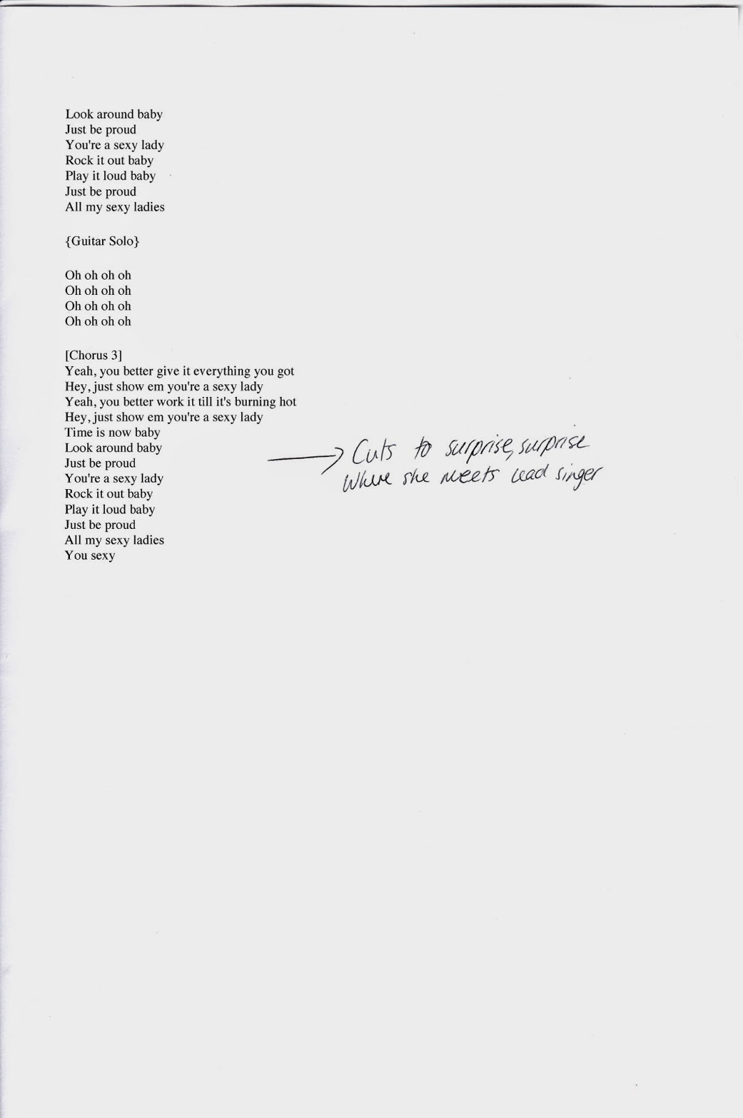
I think this song is about young girls that have low self esteem and look up to particular celebrities for inspiration. The artist herself had a rough childhood and she portrays this through her songs and through her lyrics. Therefore wanting to inspire many others that they shouldn't get down on themselves but instead look up, keep smiling and don't let other people get them down. The lyrics mention that it is okay to not fit in with the crowd, which is how she would like to see her fans feel about themselves.

Song Choice Post
I have chosen the song 'Sexy Lady' by Jessie J. I have chosen to make a music video of this song because it has a very fast pace to it creating an opportunity for me to create a lively music video for the song. The genre of the song is pop, with pop the conventions used are fairly common. One of the main conventions for pop music videos is that they are usually based around a narrative or a concept, as well as this there will also be montage editing. The target audience for this genre of music is most likely young people aged between 16-30. However, it is mainly aimed at teenagers as well as appealing to a majority of young females.
Tuesday, 29 April 2014
Advertising Presentation
There are two different styles to this advert, these are; parody and surreal. This advert is a parody as it focuses on an opera singer singing a theme tune in a dubstep style. This is funny because it is nothing like what we would expect an opera singer to perform. As well as this, they two main actors expect the couple to love their performance, when in fact they don't. This advert is surreal because it has nothing relevant in the advert to the product they are trying to sell. The advert is about comparing car insurance and they do this in a very bizarre way, through not giving details about how the company works but instead leaving a very memorable image in the audiences minds. A technique used in this advert is that it is a solution to a problem. This is very effective as the customer can easily identify that go compare will end up saving them money on their car insurance, so therefore this is a solution to saving them money. This advert appeals at every class with the possible exception of class 'A', this is because the advert is about saving money, which might not appeal to upper class people but however have a huge influence on the middle and lower class people.
This advert has a very dramatic style to it, this is because their advert is about a very serious situation that is currently happening. They use sad images in order to pressure the audience into donating towards their charity. As well as this, emotion can also be triggered through watching this advert. It is deeply saddening as they have used the most horrific images and this leaves the audience feeling guilty that they have not donated. The overt message in this avert is that there are animals suffering, however, if we donated a small amount each month this would help to care for these rescued animals. I think this advert appeals to every class, possibly with the exception of class E. This is because the advert asks for a small donation from anyone with any background. Therefore they expect most people to be able to donate £2 of their income each month towards the RSCPA.
The wonga advert has a very humorous style to it, this is because we see an animated elderly group of friends advertising their product. The elderly man tries to impress these woman in each series of the advert, rather than getting to the point of selling their product. This advert focuses on being a solution to a problem, which is effective because we can see that this is loaning company and they discuss the things that they could do whilst they wait for the money to be transferred. This advert appeals to classes E, D and partly C2, this is because we assume these classes are more likely to be in need of a loan.
This advert has a very dramatic style to it, this is because we see her quickly taking off items of clothing until we reach the end, where we imagine she is nude as it cuts to a shot of the perfume bottle. This advert also uses celebrity endorsement to attract customers, the advert stars Charlize Theron who is an actress as well as a model. This helps to attract customers as they are made aware that she wears this perfume, so they will want to wear it as well. The advert appeals to classes A, B and C1 this is because this is a very expensive perfume, we can see this by the amount of gold and expensive jewellery shown in the advert.
This advert has a surreal style to it, I think this because there is nothing in the advert that is relevant to the product. The product in the advert is a mars bar however we are shown three footballers participating in a match. This also uses celebrity endorsement as there are three first team England footballers. This means that football fans will want to buy their product knowing that players from their team appear in the advert. This appeals to every class, especially men that are interested in football. I think this because the advert focuses on football so anyone with a similar interest would be interested in buying their product.
Subscribe to:
Posts (Atom)