I have selected to analyse two different conventions of music videos, these being costumes and setting. I will be comparing the two conventions from Paramores video 'Still into you' and Shakespeare's Sister 'Stay'.
Firstly I will discuss 'still into you', the lead singer of the band is wearing very bright colours, this can include a multi coloured jacket along with neon tights. However, the rest of the band are shown wearing darker clothing. This is because we are supposed to focus more on the lead singer and by showing her wear these eye-catching colours we are drawn to her.
The costumes worn are also stereotyped to the type of genre music that the band play. Paramore are a rock band, due to this the band members are all wearing ripped clothing to give a punk/rock look to them. This gives the impression that they have a certain attitude that they would like to convey to their target audience.
The location of the music video is a house, this is very alternative as we'd expect to see a love story which is set to the lyrics, as opposed to a band inside roaming around free inside a house.
Many different props are used in this video, mainly props that shouldn't be inside a house, for example, a bike and a fishing boat. This gives the impression that they are breaking the rules, as well as the fact that the props are used to trash the house.
Secondly, I will discuss 'stay' both singers are wearing dark costumes, this is to go with the genre of music that they play, which is Gothic. They both also have very pale make up on, which too is to suit the genre of music they play.
The man laying on the bed is not wearing any clothes, this is because we have the impression that he has been in a tragic accident and that he is on his death bed.
The second singer is portrayed to be quite scary, this is shown by her having dark make up and doing scary facial expressions. She is also pictured to have a sparkly outfit on, this is very eye-catching and makes us look directly at her as this is a very dark and gloomy video, however, she changes this with her presence.
The location for this video is in space, however also in a hospital. This makes the video seem very unrealistic as we do not have hospitals in space at this moment in time. This is also very alternative because at the time of this video no one had seen anything like the effects and editing used.
This is also set in heaven/hell some might argue, because as we see the scary looking woman appear there are many flashing bright lights as she tries to take the man away, suggesting that he is going to heaven or hell.
Thursday, 30 January 2014

Tuesday, 28 January 2014
Music Video Conventions
Music Video Conventions
Music videos follow certain conventions, some of these include specific shot types. Most music videos will include close ups of the lead singer or the main artist. This is mainly because we are shown them lip syncing to the song. These are usually done through the use of jump cutting (fragmented editing). Depending on the genre there are different conventions for example, in a rock video there will be a full band with wide shots of said band, aswell as close ups of the lead singer. However, in a pop video there will be just the artist and they will be shown through various different shot types as the music video starts to build a narrative.
Another convention would be mise-en-scene, this can include: props, costume, location and performance. When props are used they are often band merchendise, this is shown as this can be used to advertise and promote the band as well as being used in parts of the music video. These also include instruments, which will often be shown throughout the whole music video alongside a narrative. Often the costumes worn by the band are all very similar so that we can see the band as a unit, as opposed to a singular artist. Most music videos are shot outside as there as more elements to capture, for example the weather. When we see a video and there is a heavy downpour we often associate this with a sad narrative.
There are many different editing techniques used in music videos, these can include: jump cutting, diegetic sound and cuts on beat. Jump cutting is where the band will be in one location performing, then the music video will cut and they will appear in another location, regardless of continuity. This creates a lively effect to the video as this moves very quickly to match the beat of the music. Furthermore, this leads onto cutting on beat, which most music videos will use. This is where the footage is edited to match the beat of the music, this creates a rhythm and sets a pace for the editing. Diegetic sound is the sound that the artist can hear aswell as the audience, for example this could be a car driving past. This makes the video seem more realistic.
Friday, 24 January 2014

Peer Evaluation


Tuesday, 21 January 2014
First attempt of ident


Monday, 6 January 2014
Evaluation of Lock Logo
What genre did you think the name represented? Why?
I think that Lock represents an older genre of music, specifically 70's and 80's rock music. This is because lock sounds like rock and has a very hard name. The fact that lock and rock rhyme help to advertise the radio station and target the audience. This then helps to brand the station and give it an identity, therefore enhancing listeners.


Who do you think the audience is? Why?
The target age group for the station is 50+ as these were younger and listened to 70's and 80's music at their time of youth. The station targets both male and female, however, has a slight focus on males, as they tend to be more into rock than females.

How did you aim to appeal to that audience?
I aimed to appeal to my target audience by showing them the type of genre of music lock plays, I did this by using an old looking font, so that they could see that this instantly appeals to an older audience. I also focused on using more blue as the station has a slightly male focus.
Who do you think would be the stations' competitors? Why?
I think that competitors of lock would be absolute radio and planet rock. This is because they both play the same genre of music as lock does. They also have a similar target audience to lock, aiming to target over 50's and having a male focus.
What 'look' did you want to create? Why?
I wanted to create a hard dark look to the logo as I feel this resembles rock music as a whole. This would remind the audience that lock plays heavy yet classic hits. I feel this would give an enjoyable look to the station as by playing these old hits it would bring back sentimental feelings toward the listeners, therefore giving them a feel good factor. I also wanted to show that there was a male look to the station as this is the target audience and will mostly appeal to middle aged men.
What did you think was the most successful part of your logo?
I am most please with the lock shape, this is because this element took the most time to create as I created it from scratch. I had to use a range of different tools to create the shape, all in which I taught myself and used effectively. This took up most of my time as it was such a complex shape to create, having further elements to it which needed adjusting. I also gave the lock a 3-D effect which was very difficult and time consuming, however, I overcame this independently. I also think the colour themes were very successful as they fit very well with each of the other logos.
Did your audience think that it suited the genre?
When I asked my audience for feedback they were all aware that the station played a rock style genre and that it had a male focus. This was mainly due to the name of the station and the theme colours used in the design. They also said that they liked the way I had created a lock shape to fit in between the words 'lock' and that the lock stood for an 'o' they said this worked very well and made it more eye-catching.


What skills have you developed most when creating this logo?
A skill in which I have developed the most when creating this logo is the pen tool, this is because I was using this tool the most when creating the lock shape and the key shape. I learnt that the longer spent using the tool the better quality outcome, likewise the shorter time spent using the tool the less better quality outcome.
What could you still do to make your work even better? Why?
I could perhaps add a rock element to the logo, for example a guitar. This would enhance listeners understanding of the type of genre that lock plays and what the station stands for. This would also make the logo slightly more eye-catching, however, may end up being a distraction taking the
viewers eyes away from the main points illustrated.

I think that Lock represents an older genre of music, specifically 70's and 80's rock music. This is because lock sounds like rock and has a very hard name. The fact that lock and rock rhyme help to advertise the radio station and target the audience. This then helps to brand the station and give it an identity, therefore enhancing listeners.
Who do you think the audience is? Why?
The target age group for the station is 50+ as these were younger and listened to 70's and 80's music at their time of youth. The station targets both male and female, however, has a slight focus on males, as they tend to be more into rock than females.

How did you aim to appeal to that audience?
I aimed to appeal to my target audience by showing them the type of genre of music lock plays, I did this by using an old looking font, so that they could see that this instantly appeals to an older audience. I also focused on using more blue as the station has a slightly male focus.
Who do you think would be the stations' competitors? Why?
I think that competitors of lock would be absolute radio and planet rock. This is because they both play the same genre of music as lock does. They also have a similar target audience to lock, aiming to target over 50's and having a male focus.
What 'look' did you want to create? Why?
I wanted to create a hard dark look to the logo as I feel this resembles rock music as a whole. This would remind the audience that lock plays heavy yet classic hits. I feel this would give an enjoyable look to the station as by playing these old hits it would bring back sentimental feelings toward the listeners, therefore giving them a feel good factor. I also wanted to show that there was a male look to the station as this is the target audience and will mostly appeal to middle aged men.
What did you think was the most successful part of your logo?
I am most please with the lock shape, this is because this element took the most time to create as I created it from scratch. I had to use a range of different tools to create the shape, all in which I taught myself and used effectively. This took up most of my time as it was such a complex shape to create, having further elements to it which needed adjusting. I also gave the lock a 3-D effect which was very difficult and time consuming, however, I overcame this independently. I also think the colour themes were very successful as they fit very well with each of the other logos.
Did your audience think that it suited the genre?
When I asked my audience for feedback they were all aware that the station played a rock style genre and that it had a male focus. This was mainly due to the name of the station and the theme colours used in the design. They also said that they liked the way I had created a lock shape to fit in between the words 'lock' and that the lock stood for an 'o' they said this worked very well and made it more eye-catching.
What skills have you developed most when creating this logo?
A skill in which I have developed the most when creating this logo is the pen tool, this is because I was using this tool the most when creating the lock shape and the key shape. I learnt that the longer spent using the tool the better quality outcome, likewise the shorter time spent using the tool the less better quality outcome.
What could you still do to make your work even better? Why?
I could perhaps add a rock element to the logo, for example a guitar. This would enhance listeners understanding of the type of genre that lock plays and what the station stands for. This would also make the logo slightly more eye-catching, however, may end up being a distraction taking the
viewers eyes away from the main points illustrated.
Evaluation of Pulse Logo
What genre do you think the name represented? Why?
I think that the name pulse relates to the music genre of R'n'B as R'n'B has a lot of rhythms and beats to it which in a way creates a pulse for the music and relates back to the name. This is good for advertising purposes as they will be able to include the name of the radio station into a beat to mix it all together so it makes the radio station sound very organised and well thought out, widening their audiences and listeners to many people who like a good well organised and well thought out, looked after radio station.
Who do you think the audience is? Why?
I think the audience for this radio station would be teenagers and older people from ages 15 and up as the genre the music station would play relates to the younger generation as R'n'B has quite fast beats and is very lively and energetic which relates to the younger generation of being lively wanting to live things to the full and to party meaning they will listen to this genre of music a lot more so if this radio station is playing this genre of music a lot then the younger generation would tune in a lot more and be regular listeners.
How did you aim to appeal to that audience?
I aimed to appeal this logo to younger people by using a specific style on this logo, i made it quite small and simplistic but I included some nice aesthetic graphics for listeners to look at so it appeals to their sense as i have used brighter colours like hot pink and purples. I also used quite a curvy font and a heart to aim it a little more towards females but younger females and generally younger people.
Who do you think would be the stations competitors? Why?
I believe that the stations competitors would be stations like Choice FM as they tend to play a lot of R'n'B and have a very large audience in the UK as well as a radio station called Defjay as they play only R'n'B and have a large audience. They would be big competitors to this radio station as they would have more listeners already as well as more time they could cover with various DJ's and shows that could be put on over the radio.
What 'look' did you want to create? Why?
The look for pulse I wanted to make was a current and trendy looking logo aimed towards the younger generation. I made it colourful and soft as it is aimed towards all of those of the younger generation so people wont feel that the radio station is dark and for a select few darker genres of music I wanted it to be warm and welcoming to all of the younger generation. I did this by using bright colours like pink and purple with a good looking design that relates to its name with the words being joined to a heart beat monitor type of shape as this relates top the pulse of the human body or even that of the music that is played on the radio station.
How did you create that look?
I first started by creating the word 'pulse' I did this through selecting the appropriate font from 'da font'. I wanted to make this look bolder and have an edge to it, so I decided to duplicate the word and place one in front of the other, giving it a shadow making the word stand out more.
I then wanted to create pulse shapes, I did this through using the pen tool on a selected image chosen from the internet as a base shape. I then edited this shape by using the free transform tool so that I could make one shape smaller than the other and so they would fit intricately together.
What do you think was the most successful part of your logo?
I think that the name pulse relates to the music genre of R'n'B as R'n'B has a lot of rhythms and beats to it which in a way creates a pulse for the music and relates back to the name. This is good for advertising purposes as they will be able to include the name of the radio station into a beat to mix it all together so it makes the radio station sound very organised and well thought out, widening their audiences and listeners to many people who like a good well organised and well thought out, looked after radio station.
Who do you think the audience is? Why?
I think the audience for this radio station would be teenagers and older people from ages 15 and up as the genre the music station would play relates to the younger generation as R'n'B has quite fast beats and is very lively and energetic which relates to the younger generation of being lively wanting to live things to the full and to party meaning they will listen to this genre of music a lot more so if this radio station is playing this genre of music a lot then the younger generation would tune in a lot more and be regular listeners.
How did you aim to appeal to that audience?
I aimed to appeal this logo to younger people by using a specific style on this logo, i made it quite small and simplistic but I included some nice aesthetic graphics for listeners to look at so it appeals to their sense as i have used brighter colours like hot pink and purples. I also used quite a curvy font and a heart to aim it a little more towards females but younger females and generally younger people.
Who do you think would be the stations competitors? Why?
I believe that the stations competitors would be stations like Choice FM as they tend to play a lot of R'n'B and have a very large audience in the UK as well as a radio station called Defjay as they play only R'n'B and have a large audience. They would be big competitors to this radio station as they would have more listeners already as well as more time they could cover with various DJ's and shows that could be put on over the radio.
What 'look' did you want to create? Why?
The look for pulse I wanted to make was a current and trendy looking logo aimed towards the younger generation. I made it colourful and soft as it is aimed towards all of those of the younger generation so people wont feel that the radio station is dark and for a select few darker genres of music I wanted it to be warm and welcoming to all of the younger generation. I did this by using bright colours like pink and purple with a good looking design that relates to its name with the words being joined to a heart beat monitor type of shape as this relates top the pulse of the human body or even that of the music that is played on the radio station.
How did you create that look?
I first started by creating the word 'pulse' I did this through selecting the appropriate font from 'da font'. I wanted to make this look bolder and have an edge to it, so I decided to duplicate the word and place one in front of the other, giving it a shadow making the word stand out more.
I then wanted to create pulse shapes, I did this through using the pen tool on a selected image chosen from the internet as a base shape. I then edited this shape by using the free transform tool so that I could make one shape smaller than the other and so they would fit intricately together.
What do you think was the most successful part of your logo?
I believe that the most successful part of my logo was the joining of the word pulse to the pulse lines of a heart beat monitor as it took a lot of tools and different methods to join the words to the graphic and make them seem joined in a natural way instead of it seeming to be forced to be joined, I believe that the logo looks very natural and well thought out.
Did your audience think that it suited the genre?
Did your audience think that it suited the genre?
Yes because when i asked my audience for the feedback on my logo they knew straight away that it was to do with some sort of R'n'B as the pulse lines gives the logo a vibe and makes the radio station seems like it has a beat which relates to the music of the genre of R'n'B. The feedback I recieved was very positive about how it related and suited the genre well.
What skill have you developed most when creating this logo?
What skill have you developed most when creating this logo?
I think that the skill i have developed most was the use of layering different images to provide different effects like creating a shadow or making the words seem thicker or have a bit more density as well as the skill of being able to stitch together two or more images to help with the layering of the images.
What could you do to make your work even better? Why?
I believe that I could improve the logo by adding in a background to the logo or maybe some surrounding background objects to bring a sense of depth to the logo to show that the company cares about its appearance and that they care about what people think about it so then they will know that the radio station cares about what music they play to please their audiences.
What could you do to make your work even better? Why?
I believe that I could improve the logo by adding in a background to the logo or maybe some surrounding background objects to bring a sense of depth to the logo to show that the company cares about its appearance and that they care about what people think about it so then they will know that the radio station cares about what music they play to please their audiences.
Friday, 20 December 2013
Evaluation of Mixx Logo
What genre do you think the name represented? Why?
I think the name mixx represents a club mix and top 40 hits genre. This is fresh and new music that is seen as the current genre. I would expect this type of music to be played in clubs and bars; this is because the name mixx sounds like ‘remix’. I would then associate ‘remix’ with DJ’s, which often work in clubs and bars. Also mixx should be spelt ‘mix’ this gives a rebellious look to the name, with this in mind I think the target audience for this radio station is young adults aged 18+, targeting both genders. A reason as to why it is aimed at young adults is because these are the type of aged people that expected to be in clubs and bars.
Who do you think the audience is? Why?
The target audience for this radio station is young adults, targeting both genres. I think this because these are the sort of people that you would normally expect to find in nightclubs and bars, dancing to this sort of genre of music.
How did you aim to appeal to that audience?
I attempted to appeal to my target audience by putting emotions on the logo, there is an open mouth as my logo looks like a face. This face looks like its having fun, therefore the audience will resemble having fun and being happy with mixx radio station. I also feel that my logo design is very unique which would appeal to the target audience as they would see this as something new and exciting to relate to. The colours used are also unisex so this factor would help appeal to both genders, as the logo is not too girly or too boyish.
I attempted to appeal to my target audience by putting emotions on the logo, there is an open mouth as my logo looks like a face. This face looks like its having fun, therefore the audience will resemble having fun and being happy with mixx radio station. I also feel that my logo design is very unique which would appeal to the target audience as they would see this as something new and exciting to relate to. The colours used are also unisex so this factor would help appeal to both genders, as the logo is not too girly or too boyish.
Who do you think would be the stations competitors? Why?
The competitors of this station would be kiss and capital, mainly because they both play similar music to mixx. So therefore they would have the same target audience. Thus meaning there would be three competitive stations, however my station will stand out because it targets both genres and is less repetitive than kiss and capital.
The competitors of this station would be kiss and capital, mainly because they both play similar music to mixx. So therefore they would have the same target audience. Thus meaning there would be three competitive stations, however my station will stand out because it targets both genres and is less repetitive than kiss and capital.
What 'look' did you want to create? Why?
I wanted to create a fresh and popular look for my logo, this would help give the audience an idea of the type of music that is played on my station. Therefore, targeting a younger audience with similar views towards music. By successfully creating this look I would then be able to capture a vast majority of my target audience, through promoting the radios personality. The station focuses on targeting both genres as I imagine the station being played in a club therefore both genders dancing to the music together.
I wanted to create a fresh and popular look for my logo, this would help give the audience an idea of the type of music that is played on my station. Therefore, targeting a younger audience with similar views towards music. By successfully creating this look I would then be able to capture a vast majority of my target audience, through promoting the radios personality. The station focuses on targeting both genres as I imagine the station being played in a club therefore both genders dancing to the music together.

How did you create that look?
I first wanted to create a musical note shape, I did this through looking at the shapes available in Photoshop. I transformed the note by making it have a slight slant to the shape. I felt that this gave a rebellious and edgy look to the logo. I first gave the shape a dark shade of purple, however, with the feedback I received I felt this was too girly. With this feedback in mind I changed the colour of the note to blue, which was more suitable for both genders.
 I then chose the most appropriate font via 'da font' which was narrowed down to three choices, I made my decision based upon which was the most unisex and fresher looking font. I then edited this font using the paragraph and palette tool, through this I was able to give the logo a happy face look. Which I could then use to symbolise that my station has a feel good factor to it. This shows that my logo has a deeper meaning to what is actually being shown, enhancing listeners to want to find this out.
I then had to think of ways to develop my logo into a family of logos, I did this by using the 'OW!' logo in numerous places in each logo. Also I was able to do this by using the same colour themes in each of these logos, so I had to use the eyedropper tool, in order for this to be the exact same colour. I then thought of creative ways in which I was able to balance the colour themes.
 I was then reminded that from my feedback the 'x' was seemed to be out of place, with this in mind I transformed the 'x' and zoomed in as this creates more accuracy when moving the letter. I placed the 'x' in between 'mix' and the oval shape. This created a face look to the logo, with the 'x' looking like a nose of a person.
What do you think was the most successful part of your logo?
I am most pleased with the logo turned out exactly how I imagined it too. With my Photoshop skills I was able to use a variety of techniques to solve any problems that occurred. I am also pleased that my logo looks like a person having fun, this was a create way in which I used to target the audience by reminding them that the station is all about enjoyment and fun, so this represented this very well. I was also able to make changes to my logo which had been suggested by the feedback I received, I took the constructive criticism very well and was able to produce a better logo design when following this feedback.
I am most pleased with the logo turned out exactly how I imagined it too. With my Photoshop skills I was able to use a variety of techniques to solve any problems that occurred. I am also pleased that my logo looks like a person having fun, this was a create way in which I used to target the audience by reminding them that the station is all about enjoyment and fun, so this represented this very well. I was also able to make changes to my logo which had been suggested by the feedback I received, I took the constructive criticism very well and was able to produce a better logo design when following this feedback.
Did your audience think that it suited the genre?
When I presented my logo design to the audience they were aware that mixx plays club and mix music, part of this was due to the name of the station. However, they could tell through the emotion shown in my design, which represents fun, which then suits being in clubs and having a good time. They also recognised that this was aimed at both genders, as they were aware that there was a good balance between the colours used.
When I presented my logo design to the audience they were aware that mixx plays club and mix music, part of this was due to the name of the station. However, they could tell through the emotion shown in my design, which represents fun, which then suits being in clubs and having a good time. They also recognised that this was aimed at both genders, as they were aware that there was a good balance between the colours used.
What skill have you developed most when creating this logo?
I have developed the eyedropper tool the most when creating this logo, this is because I was not very familiar with this tool at first. However, with some practice I was able to teach myself how to use the tool effectively. It was very important that I acquired this new skill because I was frequently using this tool as each logo design uses the exact same colours.
I have developed the eyedropper tool the most when creating this logo, this is because I was not very familiar with this tool at first. However, with some practice I was able to teach myself how to use the tool effectively. It was very important that I acquired this new skill because I was frequently using this tool as each logo design uses the exact same colours.
What could you do to make your work even better? Why?
One improvement I could make is introducing a background to the logo, this would help make the logo more eye-catching and would complement the rest of the logo. Therefore giving more depth and meaning to the logo, resulting in an increase in positive reaction to the logo.
One improvement I could make is introducing a background to the logo, this would help make the logo more eye-catching and would complement the rest of the logo. Therefore giving more depth and meaning to the logo, resulting in an increase in positive reaction to the logo.
Tuesday, 17 December 2013


Friday, 13 December 2013
Role Descriptions
Role description: The role descriptions given will have the same affect
on all three of our idents when making them.
Director:
Lewis and Nicole
Camera:
Lewis
Lighting:
Nicole
Sound:
Nicole
Editing:
Lewis and Nicole
Director: I think we would
both be good for that role because we could both decide on what would look and
sound best during the ident. If we are both directors we can put our ideas into
action and decide where they would work best, rather than one person saying
where everything goes and when.
Camera: I think Lewis would
be good for controlling the camera as he has worked with filming before, and in
previous media lessons has been the cameraman during the task. He is also
confident with using the different features that are on the camera and using
the tripod whilst filming. When planning
the ident’s he put forward some ideas on how it could be shot and at what
angles also.
Lighting: I think Nicole
would be good for controlling the lighting as she thought of the ideas in how
the lighting would be used during the ident. This way she can use the lighting
to the effect that she would want it to.
Also, as Lewis would be controlling the camera during film he wouldn’t
be able to control the lighting at the specific times that it is needed.
Sound: Nicole would also be
good for the sound during the ident. She has tested the sound effects and music
on the different websites given to us and decided what sounds best and which
would be more effective for what time. Lewis would also have trouble, as he
would be controlling the camera whilst the sound comes on.
Editing: I think we would
both be good in the role of editing. We can both have our input on how it
should look at the end, as we both decided on the ideas and the way the ident
should be presented before we filmed it. Like the director role, we can both
have our ideas and decide what would look the best and what would be more
effective. This way we can both have an input on the ident and both are happy
on how it has come out.
Lock Logo Changes


Mixx Logo Changes


Pulse Logo Changes
 The first change I made was to give the pulse shape an outline. I made this change as my feedback said that it was not bold enough. I created this outline by selecting the shape and choosing the blending options, where I then gave the image a stroke effect.
The final change I made to this design was making the 'ow!' logo bigger. My feedback had said that this needed to be bigger in comparison to the pulse logo. I did this by highlighting the text and increasing the size.
Tuesday, 3 December 2013
Explanations of Which File Formats I Would Use

This logo is going to be used as a letterhead on the home page of my website, as this will be displayed on the internet I would then save this as a portable network graphics file (.PNG). This is because this file format is widely supported by recent web browsers, therefore making it appropriate to use when the logo is being placed on the internet.

This logo is going to be used on a billboard, as this will be a large file to produce I will save this as a portable networks graphic file (PNG.) This is because this file format supports high level lossless compression, which will be suitable for a billboard as this is extremely high quality.

This logo is going to be used in a magazine, as the magazine might want to change layers of my logo depending on the structure of their magazine the most suitable file format is a photoshop document (PSD.) This will allow them to manipulate the image based on the advertisement space in their magazine. A photoshop document can also be imported into other software, this will allow them to manipulate the image further if required to do so.



Explanation of Logos
My logos all fit together very well through a range of techniques I have used when designing each of these. All three logos use the same range of colours, the colours which I have selected are red, purple, blue, dark blue and black. Each logo has a percentage of each of these colours, which help to give the logos the same affect, that they are all similar. This helps brand my company by giving it an identity, all three logos will now be associated with these colours and this will help to promote each of these logos.
Another reason as to why three logos fit together is because they each have the 'ow!' logo next to each, all placed in the same position (on the top left hand side). This helps brand the channel as the audience associate the 'ow!' logo to being part of the ow company. The will then promote the radio station as the audience will trust the previous brand and they are aware of what high standards to expect.
Another reason as to why three logos fit together is because they each have the 'ow!' logo next to each, all placed in the same position (on the top left hand side). This helps brand the channel as the audience associate the 'ow!' logo to being part of the ow company. The will then promote the radio station as the audience will trust the previous brand and they are aware of what high standards to expect.
Friday, 29 November 2013
Sound and Music Decisions
Ident 1
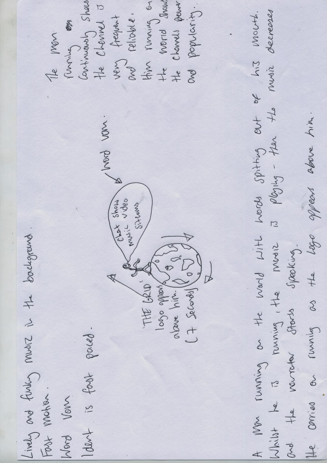
During the first ident there will be an action type sound which will be played whilst the flags come closer together, this is because it looks as if they are going to fight, so an action type sound will be suitable. After this both flags collide resulting in a bang noise being heard, this sound will be created during after effects. Before the narrator speaks the mood of the music changes, this will be upbeat to keep the audience interested. In a deep and unique voice the narrator will say 'where the best of British music and American sitcoms come together' as well as 'the grid'.
The action sound which we have chosen is 'nerves' by
The sound whilst the logo is moving is 'cut and run'
The music used for this ident will relate to the younger audiences who watch the television channel as it is quite heavy and has a strong bass line to it, it also has a 'Gangster' type of feel to it relating to the younger audiences.
Ident 2
During the second ident there will also be an action type sound which will be played whilst the buildings come closer together, this is because they will fight meaning that there will need to be a mysterious sound being played. After this the buildings collide resulting in a crash sound, which will be made during after effects. Before the narrator speaks the music will change into an exciting and vibrant track, this helps cover a wider range of target audience as this is a different genre to the type of music played in the programmes. The narrator will then say 'The Grid!'
The action sound will be 'take a chance'
The sound whilst the logo is moving is 'all this'
The Music chosen for this ident relates to an older audience but not so much older than 18, I believe it is aimed much more towards people aged 20 to 25 as it has some orchestral instruments being played but with a heavy and very grand bass. The second sound clip is also the same it is played with orchestral instruments but has a weaker bass to it but still has a sense of sophistication to it making me think that it is aimed towards people older than 18 or 19 years.
Ident 3
During the third ident there will be an action type sound which will be played whilst the plates come together, this is because this will draw the audiences attention straight to the screen as the music is very dark and exciting. After the plates collide there will be a loud bang noise, which will be made during after effects. The music changes after the bang noise is heard, this then changes to a funny upbeat track as the constant change means that the audience will not get bored. The narrator will then say 'the grid'
The action sound will be 'the descent'
The sound whilst the logo is moving is 'vanes'
The sounds picked for this ident are aimed for people around the ages of 25 to 30 years as they are very orchestral and quite sophisticated pieces of music, they don't have any sort of synthetic bass lines they are all live played music and quite quick.
During the first ident there will be an action type sound which will be played whilst the flags come closer together, this is because it looks as if they are going to fight, so an action type sound will be suitable. After this both flags collide resulting in a bang noise being heard, this sound will be created during after effects. Before the narrator speaks the mood of the music changes, this will be upbeat to keep the audience interested. In a deep and unique voice the narrator will say 'where the best of British music and American sitcoms come together' as well as 'the grid'.
The action sound which we have chosen is 'nerves' by
The sound whilst the logo is moving is 'cut and run'
The music used for this ident will relate to the younger audiences who watch the television channel as it is quite heavy and has a strong bass line to it, it also has a 'Gangster' type of feel to it relating to the younger audiences.
Ident 2
During the second ident there will also be an action type sound which will be played whilst the buildings come closer together, this is because they will fight meaning that there will need to be a mysterious sound being played. After this the buildings collide resulting in a crash sound, which will be made during after effects. Before the narrator speaks the music will change into an exciting and vibrant track, this helps cover a wider range of target audience as this is a different genre to the type of music played in the programmes. The narrator will then say 'The Grid!'
The action sound will be 'take a chance'
The sound whilst the logo is moving is 'all this'
The Music chosen for this ident relates to an older audience but not so much older than 18, I believe it is aimed much more towards people aged 20 to 25 as it has some orchestral instruments being played but with a heavy and very grand bass. The second sound clip is also the same it is played with orchestral instruments but has a weaker bass to it but still has a sense of sophistication to it making me think that it is aimed towards people older than 18 or 19 years.
Ident 3
During the third ident there will be an action type sound which will be played whilst the plates come together, this is because this will draw the audiences attention straight to the screen as the music is very dark and exciting. After the plates collide there will be a loud bang noise, which will be made during after effects. The music changes after the bang noise is heard, this then changes to a funny upbeat track as the constant change means that the audience will not get bored. The narrator will then say 'the grid'
The action sound will be 'the descent'
The sound whilst the logo is moving is 'vanes'
The sounds picked for this ident are aimed for people around the ages of 25 to 30 years as they are very orchestral and quite sophisticated pieces of music, they don't have any sort of synthetic bass lines they are all live played music and quite quick.
Mixx Logo Explanation
- I first opened photoshop and created an a4 size template, as this can be changed at anytime.
- I then created a musical note, this was found in the shapes section.
- I then created an outline on the note through blending options, applying a stroke and editing this to my prefered size.
- I preferred to have an outline on the shape as this really makes the shape stand out more and become bolder.

- I then added some smaller notes by cropping the first initial musical note shape, I was able to do this by selecting half of the shape and cutting this to produce the smaller note.
- I then changed the colour of these notes to blue, and free transformed them to create a slanted look.

- My next step was to create my text, I did this through importing my text from 'da font' and editing the text using the paragraph and palette tool. I changed the text a few times as I was unsure of which text went better with the slanting musical note.

- To create an open mouth affect I used a cresent shape from the shape menu and gave this shape an outline whilst also making the shape red using the bucket tool.

- Finally, I added the 'Ow!' logo and insterted this next to the note shape.
 I decided to have the mouth open rather than a smile as I thought this looked better in the final logo design.
Thursday, 28 November 2013
Lock Logo Explanation
- I first opened up photoshop and used an a4 size template as this can be changed at any time.
- I then selected a key image from the internet, went round this with the pen tool and created my own key shape.


- I changed the colour of the key to red using the bucket tool and then imported an image of a lock from the internet and used the same technique to produce this.

- I then changed the colour using the bucket tool and created an outline through blending options to apply stroke, which gave the lock an outline.


Subscribe to:
Posts (Atom)